give me a daisy

~ ~ ~ ~ read ~ write ~ look ~ listen ~ create

Archive for the category “Art”

celebrating zentangle

zentangle1Zentangle, you say? What the heck is that?

The short and simple answer is that it’s a combination of meditation and doodling. Maybe it could have been called moodling, but I like zentangle better.

I will let the folks who created this process describe it.

Anything is Possible One Stroke at a Time

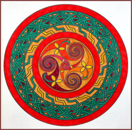
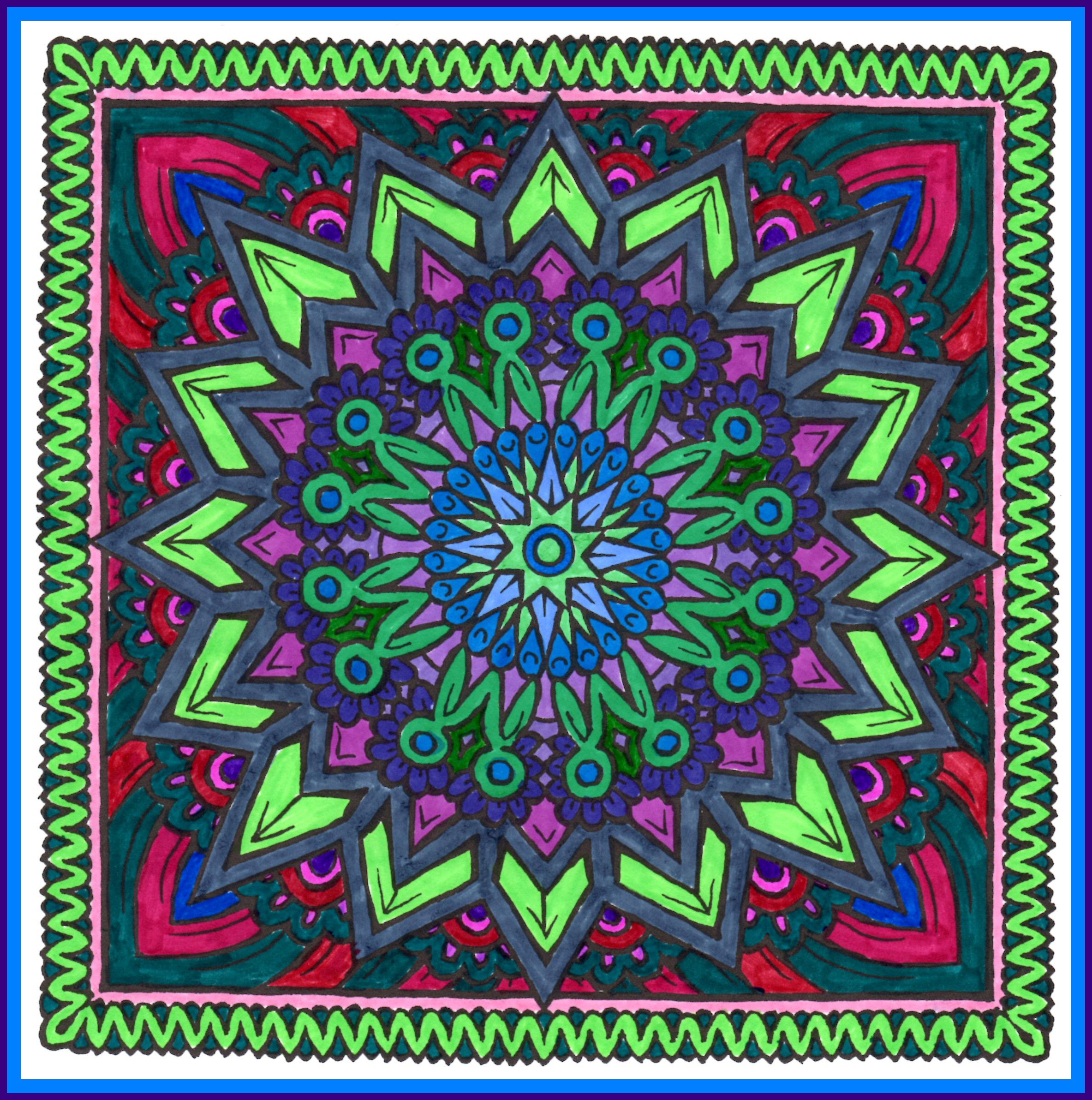
At first glance, a Zentangle creation can seem intricate and complicated. But, when you learn how it is done, you realize how simple it is . . . sort of like learning the secret behind a magic trick. Then, when you create a piece of Zentangle art, you realize how fun and engrossing the process itself is.

Zentangle uses “simple deliberate strokes which build on each other in beautiful, mesmerizing and surprising ways.” The tools of this art are few, simple, and portable. You need some black micron pens, a couple of blending tortillons, maybe a pencil or two, and a handful of 4.5″ x 4.5″ tiles to draw on.

Opening (2)Although you can get creative with color if you like, most zentangle art is done in black and white. Using different width pens, soft pencils, and the tortillon for shading gives a three-dimensional appearance while allowing you to focus on the patterns. I have a few colored pens, but so far I’ve only used the black ones.

Fortunately no artistic talent is required to engage in this activity. Since I already had a habit of doodling, zentangling just took it to the next level. Above and to the right are a couple of my attempts. The first is called opening and the second springing forth.

Springing Forth (2)The “tangle” in zentangle is the free-form outline you begin with. In the example above you can see the rectangular outline and the strong lines running through it. The design is created by filling in the open spaces.

The one on the right is a little more loopy.

The appeal of zentangle is that it’s very relaxing, even meditative. One of the few rules is “no erasing!” So if you make a so-called mistake, you simply incorporate it into your drawing. It’s sort of like life, which also doesn’t come equipped with an eraser.

My favorite way to zentangle is to get out my pattern books and my supplies, create my tangle on a tile, and decide which patterns I want to start with. I always like to try one or two new patterns. Music is a good accompaniment. So is a cup of hot tea or even a glass of wine.

If you haven’t heard of zentangle yet, you’ll be surprised to discover how many books, websites, and even videos are available to show you how to do it. Should you decide to try zentangling, be aware that it can be addicting. But I suspect we could all use more quiet, focused time in our lives, and zentangle can be used as a practice, the same way meditation and writing and walking are used.

This post is part of April’s 30 Days of Celebration. To read more, click on the Celebration category link.

celebrating sunflakes

OLYMPUS DIGITAL CAMERA
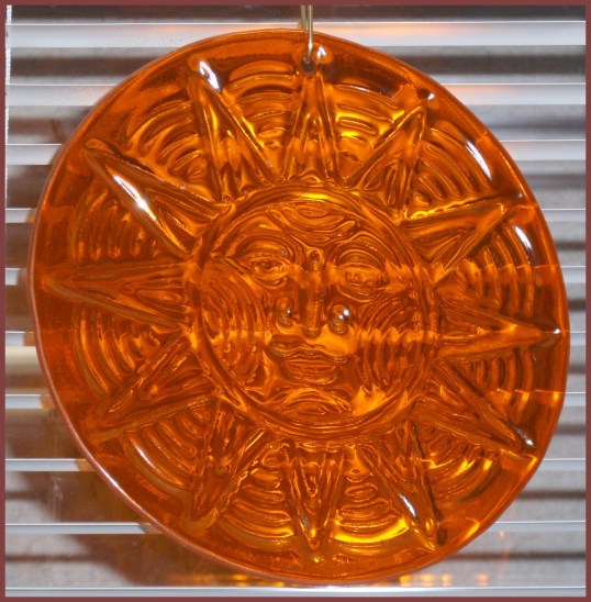
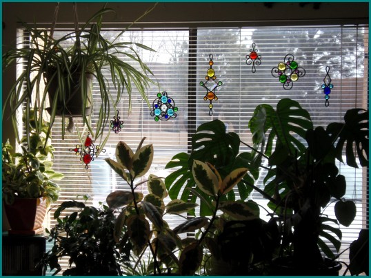
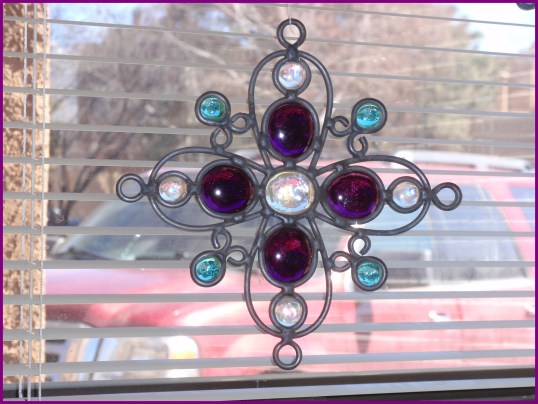
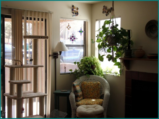
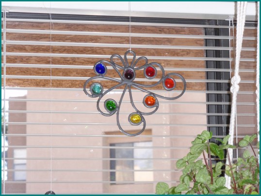
A suncatcher by any other name would be a sunflake. That’s what the artist who creates them calls them, and I’m not about to argue with her. It all began with a yen to find a single suncatcher to hang in my kitchen window. I searched retail stores and art galleries off and on for well over a year. I also searched online for almost as long before I came across exactly what I was looking for. It’s the one on the lower left in the photo below. But as you can see, it has company.

OLYMPUS DIGITAL CAMERA

I wasn’t able to stop after getting just one sunflake. So I thought maybe I’d get another one or two for windows in the living room. Sunflake #2 is the fourth from the right.

OLYMPUS DIGITAL CAMERA

It turned out that I couldn’t stop with two, either—or with three or four or eight. I now have close to 24 sunflakes hanging in front of the windows in my apartment. The ones in my living room, including this beauty below, sparkle at the first light of day, while the array (above) in my dining room window glints and gleams as the rays of the afternoon sun cross its path. The three in the kitchen reflect the last of the bright light in late afternoon.

OLYMPUS DIGITAL CAMERA

Here you can see it with a couple of its bright companions.

OLYMPUS DIGITAL CAMERA

The source of these beauties is Amber Bechtol of Natural Curve Creations in Leander, Texas. After I’d ordered several pieces from Amber, I realized she was willing to customize the colors of her designs. Of the several pieces she customized for me, this is my favorite. The design is called Zephyr and the color choice is rainbow. So I have a rainbow Zephyr hanging in my kitchen window!

OLYMPUS DIGITAL CAMERA

Although I wondered if I was going a little overboard while building this collection, I have to say I have never regretted acquiring any of them. I notice and appreciate them every single day. Each one is a celebration of light, color, artistry, and joy.

Thank you, Amber!

This post is part of April’s 30 Days of Celebration. To read more, click on the Celebration category link.

celebrating public art

public art1No matter what part of Albuquerque you travel through, you’re bound to encounter one or more of the 800 works of public art scattered across the city. Many of them are the result of Albuquerque’s 1978 Art in Municipal Places Program, which sets aside 1% of City construction funds for the purchase or commission of works of art.

Whether you love or hate individual pieces, you can’t deny that all of these sculptures, murals, and colorful mosaics add immeasurably to the sense of place.

I particularly enjoy the gorgeous mosaics that decorate the entrance to my local library as well as the downtown Convention Center. This (below) is one portion of the Juan Tabo Public Library facade.

public art6

Here are a few more. Which ones do you like best?

GE

public art3public art4

public art5

This post is part of April’s 30 Days of Celebration. To read more, click on the Celebration category link.

celebrating the world of typography

fonts1Are you old enough to remember manual typewriters? If you wanted to produce decent-looking print material back then, you actually had to have it professionally typeset and printed. Selectric typewriters made proportional fonts possible, but they were no threat to printing professionals. During the selectric-typewriter age, I worked for a book publisher in San Francisco where I spent a fair amount of time editing proofs. And for quite a few years after that, I continued interacting with printing companies.

The introduction of word processors and then personal computers didn’t initially have any effect on the traditional print process. But enter Apple computers, and all of that changed in a very short time. Adobe started making fonts—and font families—available for Apple computers, and in short order, I was totally on their hook. I drooled over the Adobe font catalog trying to decide which fonts to buy. (I mean these fonts could actually be mine!) After making my decision, I went to the Apple store to purchase them, after which I had to manually install them on my computer.

Somewhere I came across a bumper sticker that read, “He who dies with the most fonts wins.” I put it up in my office. Because I intended to win.

I work on a PC now, and the graphic interface just isn’t as good as a Mac’s. I’ve learned to live with it, but I don’t like it. Yes, I have access to far more fonts now than I did 25 years ago when I had to go to the Apple store to pick them out one or two at a time. But printing from a PC leaves a lot to be desired when compared to either printing from a Mac or professional typesetting.

fonts2Occasionally I indulge myself by “leafing through” some of the online font catalogs reacquainting myself with some old favorite: Antique Olive, ITC Berkeley Oldstyle, Friz Quadrata, ITC Novarese, Nueva (used in the photo on the right), Ocean Sans, and Optima. There’s something about the shape and proportion of letters that I think I’ve always paid attention to—sometimes more than to the actual words or even the meaning. It’s not unusual for me to check out what font was used in a book I’m reading.

Typography is something most of us ordinarily take for granted. So I’m celebrating typography today, along with the artists who design typefaces, because beautiful typography has added a dimension of pleasure to my life for many decades. Maybe it has done the same for you without your being aware of it.

This post is part of April’s 30 Days of Celebration. To read more, click on the Celebration category link.

celebrating bright things redux

sparkleThe world is full of poetry.
The air is living with its spirit;
and the waves dance
to the music of its melodies,
and sparkle in its brightness.

–James Gates Percival

One cold, dark winter afternoon when the temperature never rose above freezing all day and I felt trapped inside my office in front of my computer, I looked around the room at all the bright things I’ve put here.

I won’t go so far as to say say my world is full of poetry right now, but there’s a hint of its brightness here and there.

Butterfly

Butterfly

Lizards

Lizards

Suncatcher

Suncatcher

Tiger

Tiger

Mandala

Mandala

Vase (underwater upside down)

Vase (underwater upside down)

Reality (ala Brian Andreas)

Reality (ala Brian Andreas)

Good Advice!

Good Advice!

A bit of brightness landed on that one. Happy Saturday!


Note: This was originally published in January 2013. If anything, my office (a/k/a my playroom, at least on a good day) is filled with even more bright things.


This post is part of April’s 30 Days of Celebration. To read more, click on the Celebration category link.

The color of my Lebanon

Absolutely luscious and enchanting photos!

Mimo Khair Creative

Too small to be divided, too large to be swallowed, too beautiful to be ignored, too charming to be forgotten… and oh the way the sun kisses my Lebanon…

View original post

Your Brain on Art, Writing, and Music

brain


Here are some recent stories about what goes on in the brain when we’re writing, making music, and appreciating art. (Originally posted on Farther to Go!)

Click on the titles to read the complete articles.


Our Brains Are Made for Enjoying Art

Ann Lukits (The Wall Street Journal)

Analysis suggests art appreciation is a natural biological process.

“Viewing paintings engages a number of different regions of the brain, suggesting art appreciation is a natural biological process, according to the report in the June issue of the journal Brain and Cognition. The study found that paintings activated areas of the brain involved in vision, pleasure, memory, recognition and emotions, in addition to systems that underlie the conscious processing of new information to give it meaning.”

This is Your Brain on Writing

Carl Zimmer (The New York Times)

Becoming skilled at writing may activate the same areas of the brain that are activated in people who are skilled at other things, such as sports or music. This study showed that the areas of the brain activated in novice writers were not the same as those activated in the skilled, “professionally trained,” writers.

“During brainstorming, the novice writers activated their visual centers. By contrast, the brains of expert writers showed more activity in regions involved in speech.”

It would appear that training is training is training—no matter what the training is for.

Musical Training Increases Executive Brain Function in Adults and Children

Jeremy Dean (PsyBlog)

“Both the brains and behaviour of adult and child musicians were compared with non-musicians in the study by researchers at the Boston Children’s Hospital. They found that adult musicians compared to non-musicians showed enhanced performance on measures of cognitive flexibility, working memory, and verbal fluency. And musically trained children showed enhanced performance on measures of verbal fluency and processing speed.”

Music Changes the Way You Think

Daniel A. Yudkin and Yaacov Trope (Scientific American)

Different music encourages different frames of mind.

“Tiny, almost immeasurable features in a piece of music have the power to elicit deeply personal and specific patterns of thought and emotion in human listeners….Ponderous, resonant, unfamiliar tonalities—the proverbial “auditory forest”—cause people to construe things abstractly. By contrast, the rapid, consonant, familiar chords of the perfect fifth—the “auditory trees”—bring out the concrete mindset….That music can move us is no surprise; it’s the point of the art form, after all. What’s new here is the manner in which the researchers have quantified in fine-grained detail the cognitive ramifications of unpacked melodic compounds.”

deep in december

a winter dream of spring

a winter dream of spring (2)

Enhanced by Zemanta

Helvetica: heart it or hate it?

Example of the Helvetica typeface. Image creat...

Can you spell boring?

I love type and typography. And I’ve been fortunate to have had several jobs that involved working with type, thus allowing me to pour over font catalogs, spend someone else’s money to amass a good-sized library of Adobe fonts, and fool around in Adobe Illustrator and Quark Xpress until my eyes glazed over. I even did a bit of freelance graphic design.

he who dies with the most fonts wins

I know there are numerous variations of this slogan, but this is the one that seems truest to me. So of course when I came across the video animation below of the history of typography, it was love at first sight.

People’s type tastes vary. Some people don’t even pay any attention to type. They can’t distinguish Bodoni from Bookman. If they use a Word Processing program, they just go with the default font.

Which brings me to the over-used default font of choice in the Western world: Helvetica. There are only two fonts I roundly despise, and the other one is Courier which I once removed from every single PC in the office where I was working (because someone actually went out of his way to use it; obviously, he had to be stopped).

There’s a wealth of sans serif fonts in the universe, including Univers, all of which are preferable to the dreadful Helvetica. I hate Helvitica. If you heart Helvetica, well, I’m sorry but we just can’t be friends anymore.

Enhanced by Zemanta

rockstar violinist

English: Violinist Joshua Bell following a per...

Even if you’re not a fan of classical music, you may know about violinist Joshua Bell from the “Stop and Hear the Music” video that’s been circulating around the internet. In January 2007, The Washington Post got Bell to agree to perform what he called “a stunt,” playing incognito in L’Enfant Plaza Station in Washington D.C. for tips, and what the subsequent Post story about it called “an experiment in context, perception and priorities — as well as an unblinking assessment of public taste: In a banal setting at an inconvenient time, would beauty transcend?”

Sadly, it did not.

Three days before, Bell had played at Symphony Hall in Boston, where tickets went for around $100. Shortly after the January gig at L’Enfant Plaza Station–which netted him a little over $30–he appeared at Lincoln Center for the Performing Arts to accept the Avery Fisher Prize for best classical musician in America. You can read the detailed, chatty April 2007 Post article here and watch “Stop and Hear the Music” here.

The number of people who passed by Joshua Bell on their way through L’Enfant Plaza Station that day without stopping (1,070) has now been exceeded by the number of Joshua Bell videos that have been uploaded on You Tube (1,090).

I could listen to him play all day.

Joshua Bell performing Chopin’s Nocturne in C Sharp Minor

Please do yourself a favor and take a few minutes to stop and hear the music.

Enhanced by Zemanta

Post Navigation